Graphs
Making and Using Graphs
After scientists organize data in tables, they often manipulate and organize and
then display the data in graphs. A graph is a diagram that shows a comparison
between variables. Since graphs show a picture of collected data, they make
interpretation and analysis of the data easier. The three basic types of graphs
used in science are the line graph, bar graph, and pie graph.
A line graph is used to show the relationship between two variables. The
variables being compared go on two axes of the graph. The independent variable
always goes on the horizontal axis, called the x-axis. The independent variable
such as temperature is the condition that is manipulated. The dependent variable
always goes on the vertical axis, the y-axis. The dependent variable such as
growth is any change that results from manipulating the independent variable.
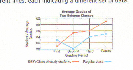
Suppose a school started a peer-study program with a class of students to see
how it affected their science grades.

You could make a graph of the grades of students in the program over a period of
time. The grading period is the independent variable and should be placed on the
x-axis of your graph. Instead of four grading periods, we could look at average
grades for the week or month or year. In this way, we would be manipulating the
independent variable. The average grade of the students in the program is the
dependent variable and would go on the y-axis.

Plain or graph paper can be used to construct graphs. After drawing your axes,
you would label each axis with a scale. The x-axis simply lists the grading
periods. To make a scale of grades on the y-axis, you must look at the data
values provided in the data table above. Since the lowest grade was 81 and the
highest was 89, you know that you will have to start numbering at least at 81
and go through 89. You decide to start numbering at 80 and number by twos spaced
at equal distances through 90.
You next must plot the data points. The first pair of data you want to plot is
the first grading period and 81. Locate "First" on the x-axis and 81 on the
y-axis. Where an imaginary vertical line from the x-axis and an imaginary
horizontal line from the y-axis would meet, place the first data point. Place
the other data points the same way. After all the points are plotted, connect
them with a smooth line.

What if you wanted to compare the average grades of the class in the study group
with the grades of another class? The data of the other class can be plotted on
the same graph to make the comparison. You must include a key with two different
lines, each indicating a different set of data.
Bar graphs are similar to line graphs, except they are used to show comparisons
among data or to display data that does not continuously change. In a bar graph,
thick bars rather than data points show the relationships among data.
To make a bar graph, set up the x-axis and y-axis as you did for the line graph.
The data are plotted by drawing thick bars from the x-axis up to an imaginary
point where the y-axis would intersect the bar if it were extended.
Look at the bar graph above comparing the wing vibration rates for different
insects. The independent variable is the type of insect, and the dependent
variable is the number of wing vibrations per second. The number of wing
vibrations for different insects is being compared.

A pie graph uses a circle divided into sections to display data. Each section
represents a part of the whole. When all the sections are placed together, they
equal 100 percent of the whole.
Suppose you wanted to make a pie graph to show the number of seeds that
germinate in a package. You would have to determine the total number of seeds
and the number of seeds that germinate out of the total. You count the seeds and
find that the package contains 143 seeds. Therefore, the whole pie will
represent this amount.
You plant the seeds and determine that 129 seeds germinate. The group of seeds
that germinated will make up one section of the pie graph, and the group of
seeds that did not germinate will make up another section.
To find out how much of the pie each section should take, you must divide the
number of seeds in each section by the total number of seeds. You then multiply
your answer by 360, the number of degrees in a circle. Round your answer to the
nearest whole number. The number of seeds that germinated would be determined as
follows:
143 X 360 = 324.75 or 325
129

* To plot these data on the pie graph, you need a compass and a protractor. Use
the compass to draw a circle. Then, draw a straight line from the center to the
edge of the circle. Place your protractor on this line, and use it to mark a
point on the edge of the circle at 325̊. Connect this point with a straight line
to the center of the circle. This is the section for the group of seeds that
germinated. The other section represents the group of seeds that did not
germinate. Complete the graph by labeling the sections of your graph and giving
the graph a title.
Examples
Making a graph
A bar graph show uses bars to represent the values of a data set. Bar graph
are used to compare data from several situations.
Example 1
The table 1 display Does brand names of several products matter when you buy
them?
| Product |
Conditioner |
Jeans |
Athletics shoes |
Shampoo |
Soft Drinks |
Gum |
|
% of people |
30 |
50 |
50 |
40 |
30 |
20 |
Double Bar graph Shows two bars together and compares two
related sets.
Example 2
Teenagers who buy music have different tastes from those who don=
t. Create a double bar graph to see what music style they disagree most. Display
the data in a double bar graph.
| Music Style |
Rap |
Alternative |
Country |
Top 40 |
|
Buyers |
81 |
61 |
41 |
61 |
|
Non buyers |
73 |
46 |
51 |
57 |
A line graph is a line drawn through pairs of associated numbers
on a grid. It is usually used to show changes over time.
Example 3
The table display U.S. teenagers income from 1986 to 1994.
display the data in a line graph to determine the year with the most dramatic
increase.
|
Year |
86 |
87 |
88 |
89 |
90 |
91 |
92 |
93 |
94 |
|
Billions of Dollar |
65 |
68 |
73 |
78 |
94 |
95 |
88 |
86 |
96 |
A double line graph Shows two line graph together to compare two
related data sets
Example 4
The table show some yearly median earnings (in thousands of
dollar) for men and women. display the data in a double line graph.
| Year |
1988 |
1989 |
190 |
1991 |
1992 |
|
Men |
26.7 |
27.3 |
27.7 |
29.4 |
30.4 |
|
Women |
17.6 |
18.8 |
19.8 |
20.6 |
21.4 |
Practice 1
1. Create a bar graph to represent the data Draw a conclusion
about the relationship between life-span and size of animal based
on the data.
|
Animal |
Dog |
Cat |
Rabbit |
Guinea pig |
Mouse |
|
Avarege Life-Span (Yr) |
12 |
12 |
5 |
4 |
3 |
2. Create a line graph to represent the data. Draw a conclusion
about the number of U.S. postmasters after 1994.
| Year |
1988 |
1989 |
1990 |
1991 |
1992 |
1993 |
1994 |
|
Thousands of postmasters in U.S. |
28 |
27 |
27 |
27 |
26 |
25 |
27 |
3. Draw a line graph of the average monthly production of cars (
in thousands) in the U.S. from 1986 to 1992. About how many cars were made in
1990?
| Year |
1986 |
1987 |
1988 |
1989 |
1990 |
1991 |
1992 |
|
Cars |
474 |
451 |
504 |
567 |
592 |
590 |
626 |
|
SUV |
354 |
451 |
500 |
568 |
598 |
458 |
600 |
4. Draw a circle or pie graph of the products from one barrel of
crude oil
|
Products |
Percent |
|
Coke |
3.5 |
|
Fuel oil |
28.6 |
|
Jet fuel |
9.1 |
|
Gasolines |
46.7 |
|
Waxes |
.1 |
|
Kerosene |
.9 |
|
Lubricants |
1.3 |
|
Liquified gases |
2.9 |
|
Asphalt and road oil |
3.1 |
|
Petrochemical and Misc |
3.8 |
Draw a pie graph for the following information
Elements in earth surface
|
Elements |
Percent |
|
Aluminum |
8.1 |
|
All others |
1.2 |
|
Calcium |
3.6 |
|
Iron |
5.0 |
|
Magnesium |
2.0 |
|
Oxygen |
46.6 |
|
Potassium |
2.6 |
|
Silicon |
27.7 |
|
Sodium |
2.8 |
|
Titanium |
.4 |
Pie graph
This kind of graph makes it easy to compare how one part
relates to whole amount.
Example 5
The table display the composition of the air.
| Composition of
the air |
|
Gas |
Percent |
|
Nitrogen |
78 |
|
Oxygen |
21 |
|
Other gases |
1 |
Example 6
The table display the amount of video games consoles sells in
2003 by some toy store. Draw a pie graph.
| Video game
console sells in 2003 |
|
Video game console |
Amount |
|
PS2 |
245 |
|
Game Cube |
98 |
|
X-Box |
198 |
Practice 2
SKILL BUILDER { MAKING A GRAPH)
WHAT KIND OF GRAPH
WHEN YOU MAKE A GRAPH, THE FIRST STEP IS TO DETERMINE WHAT KIND OF GRAPH TO USE.
WHAT YOU WANT TO SHOW AND THE KIND OF DATA YOU HAVE DETERMINE WHICH GRAPH IS THE
MOST USEFUL. A PIE GRAPH IS USEFUL FOR SHOWING PARTS IN PROPORTIONS OF A WHOLE.
A BAR GRAPH IS USEFUL FOR COMPARING QUANTITIES AND CHANGE OVER TIME. A LINE
GRAPH IS GOOD FOR COMPARING TO SET OF DATA OR FOR SHOWING CHANGES AND TRENDS
OVER TIME. STUDY THE DATA TABLE BELOW BEFORE ANSWERING THE FOLLOWING QUESTIONS.
| COMPOSITION OF CONCRETE |
U.S.
POUPLATION BY YEAR |
| SUBSTANCE |
PERCENTAGE |
YEAR |
POPULATION |
| AGGREGATE |
43 |
1910 |
91,972,266 |
| SAND |
33 |
1930 |
122,775,046 |
| CEMENT |
16 |
1950 |
150,697,361 |
| WATER |
8 |
1970 |
203,302,031 |
| |
|
1990 |
248,709,873 |
GROWTH DATA
| GROWTH DATA |
| AGE(YEARS) |
HEIGTH |
| RAUL |
ROSA |
| 5 |
120 |
108 |
| 6 |
123 |
112 |
| 7 |
126 |
116 |
| 8 |
129 |
121 |
| 9 |
134 |
126 |
| 10 |
139 |
131 |
| 11 |
143 |
138 |
| 12 |
147 |
145 |
| 13 |
151 |
150 |
| 14 |
155 |
155 |
| 15 |
159 |
158 |
| 16 |
168 |
161 |
| 17 |
176 |
163 |
| 18 |
186 |
164 |
1. WHAT KIND OF GRAPH WOULD YOU USE FOR THE DATA TABLE SHOWING THE CONCRETE
COMPOSITION? EXPLAIN YOUR CHOICE.
2. WHAT KIND OF GRAPH WOULD YOU USE FOR THE DATA TABLE SHOWING THE GROWTH DATA?
EXPLAIN YOUR CHOICE. WHO IS TALLER AT AGE 8? AT AGE 14?
3. WHAT KIND OF GRAPH WOULD YOU USE FOR THE DATA TABLE SHOWING THE U.S.
POPULATION CHANGES SINCE 1910? EXPLAIN YOUR CHOICE.
4. MAKE A GRAPH FOR EACH DATA TABLE SHOWN. FOR EACH GRAPH USE LABELS, SCALES AND
TITLES AS NEED