|
|
MY VERY FIRST SCURK PROJECT
My Suburban House
The colors, the size, those trees! ...whatever was I doing?
As you can see, I too had much to learn about making SCURK graphics.
|
|
REAL VERSUS IMAGINARY BUILDINGS
Doing real-life buildings is generally easier than inventing your own buildings, and more beneficial. When doing you own buildings out of your head, you increase the amount of work and effort required (you have to actually DESIGN the building as well as render it). I have yet to see a set of futuristic, invented buildings that, after their novelty has worn off, I truly enjoyed (granted, this is my own prejudice!). Also, doing real-life buildings allows you to examine just exactly how buildings really look (especially with regard to scale, detail, and shadow).
|
|
|
START SMALL
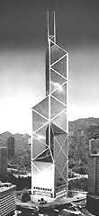
Often the best building to first start with is one you really know well, such as your house, school, or apartment building (my first SCURK graphic was of my suburban house!). It is also good if you start with something simple (i.e. no complicated angles like my Bank of China!). Start with a small building, and don't be too ambitious. A 2x2 tile base is a good starting place; 3x3 can also be manageable. Look at other SimCity buidlings to determine the appropriate scale of a building (such as how high windows and doors should be). Remember, keep it SIMPLE at first. Starting out doing a giant mega-structure on a 4x4 base quickly becomes overwhelming! If you jump into the deep-end before you know how to swim, you're going to drown.
USING PHOTOGRAPHS
When doing real-life buildings, using a photograph is usually a must. Being a college architecture student, I have access to an extensive library of architectural photos and books. However, any book or photograph will do, even tourist brochures. Even a black-and-white photo is better than nothing at all. Photos are important in order to get the correct proportions, colors, and details of a building. The most useful will be any sort of aerial photos that show the building as it appears from slightly above ground (like the perspective used in SimCity 2000). While you may not need a photograph for something like your own house, photos will help when doing an image of a building that you don't know much of.
|
|
|
MODELING THE BUILDING
There are basically two methods when modeling the building -- wireframe or planes. When using wireframes, you follow the outlines of the building. This can be helpful to determine the shape or size of a building. I sometimes like to make an outline of the "footprint" of the building -- the shape it has on the ground level. However, you should remember that humans do not see buildings in terms of dark outlines (like in cartoons). Instead, people view objects in space as planes of light and dark color. It depends on the particular building which method to follow (for the Bank of China, I used a wireframe approach, but for Matsumoto Castle, I used planes).
|
|
|
GRAPHING COMPLICATED BUILDINGS
(Use Only When Necessary!)
It is sometimes helpful to use graph paper when making SCURK images. This technique is rather mechanical and the process requires some pre-planning, but is extremely useful when dealing with oddly-shaped buildings, building proportions, and complicated angles (such as my Bank of China image). By drawing the image on a sheet of graph paper, you can use geometry to work out any problems, particularly with difficult angles. You can then adjust the drawing to fit the lines of the graph paper, and then follow the resulting graphed drawing as a blueprint when using SCURK. With the building essentially already laid out on the graph, you just follow the drawing as a guide. Actually modeling the building on SCURK becomes quick and simple. Remember, this requires a lot of pre-planning (see next paragraph).
|
I use scientific paper with 5 squares per centimeter. With 24 centimeters of length, you get 120 sqares on the longest side. Each little square represents 4 pixels, two along the vertical axis and two along the horizontal. This is usually just enough to fit in the largest SCURK image (SCURK images are 256 pixels tall, so with a graph sheet of 120 squares length, with each square representing two pixels vertically, you get 240. Thus, a few more rows have to be added at the top of the paper). To find the width of the of the drawing area, remember that the largest SCURK image can be 128 pixels wide. Thus, you need a space of 64 squares, each square representing two pixels horizontally. With the maximum height and width found, you must then draw in the shape of the tile base at the bottom (look at the tile base on SCURK to see what this looks like). Finally, your graph sheet is prepared and you can begin drawing in your building. Remember that each square represents four pixels, two horizontally and two vertically, and that one "dot" on the large SCURK drawing area is one pixel.
|
|
|
|
|
WORKING FROM OTHER GRAPHICS
This is a technique which I am presently experimenting with. First, you either download an image from the internet or acquire one with a scanner. You then import this image into SCURK and place it on a tilebase. Then, using the SCURK graphic tools, you modify and clean up this image until it matches the artwork found in SimCity 2000. The convenience of this procedure is that the building's shape and color can be easily used from the imported image. The real work is in cleaning up the image and adjusting its perspective to fit with other SCURK graphics.
I am trying this technique with the Osaka World Trade Center's Cosmotower. Using base images found on the internet, I am slowly constructing a SCURK building graphic. First I used a graphic program (such as Photoshop) to resize the downloaded raw images to match the scale of SimCity 2000. The raw images were then imported onto SCURK tilebases. Much adjusting of the perspective was required, as was a lot of cleaning up. I also cut and paste portions of one image onto another. This cutting and pasting was especially useful in creating the reflections on the glass facade. The glass panels were merely taken from the base images. My graphic of the Cosmotower shall eventually be finished soon.
|
|
|
SHADE AND SHADOW
Shade and shadow are extremely important, as they help to define the shape of objects we see in space. We do not see buildings as having dark outlines (like cartoons), but instead as having light faces and dark faces. The side of the building that is not facing the sun is in shade (or is said to be shaded), and thus is slightly darker than the side that is facing the sun. Shadow is what is cast by the building when in sunlight. Usually shadow is cast onto the ground, but can also be cast onto other structures. Shadows are also generally darker than shade. The geometry of shadows can be quite complex and involved, but can be simply estimated and "faked" for SCURK. The best way to understand shadows is to look at SCURK images with good use of shadows (I think my images of Matsumoto Castle and OUB Center are my best examples in terms of shadow usage). Many people, including myself sometimes, tend to avoid shadows. However, with some bravery, I have found that by just going ahead and doing them, the graphic does improve. At first it will look as though you have made a terrible mess, but after a while, and with enough careful working of the shadows and details, the image actually does get better (you may not believe this, but it is true). Have courage and stick with it.
|
|
|
BE BRAVE WITH BLACK
The darker colors, especially black, tend to get neglected due to a general fear of making mistakes. However, these colors are essential to creating a good SCURK graphic. Strong darks help to give CONTRAST and CLARITY to building graphics, so be brave and use them. The expertly drawn Historic Building from the original SimCity 2000 graphics is my favorite and best illustrates what I mean.
Of course, when you first try using black you will think you have irreparably destroyed your graphic forever, but if you just keep working at it, the image will improve. This is true also when using other mediums. I once did a drawing where I was sure I had ruined it when I added dark black tonal areas. I almost gave up in disgust, but since the drawing assignment was due soon, I decided to keep with it. It eventually got better and, when finished, was proclaimed by my professor as one of the best work turned in. "This person clearly knows what he's doing," he said! What a roller-coaster ride! Now, if only I can apply that same skill to my SCURK graphics (which still tend to be too gray and "fuzzy"). The main lesson here is that from courage comes competence.
|
|
|
DEALING WITH DETAILING
Of primary importance to a SCURK image is detail. In fact, the degree of detailing is often a great way to distinguish real-life SCURK images from invented buildings. It appears that when doing buildings out of their heads, most people tend to simplify the buildings and use less detail (it becomes easier to think and involves less work). Such buildings, however, often appear "box-like" or even cartoonish. Details not only include such things as the number of windows and doors, but different types of windows, trim, ground-level structures, and roof-top structures. Even the tiniest hint of a window sill can change the appearance of an image and give depth and realism. This is why photographs are very helpful.
|
A funny thing about details (such as sculpture) is that close up the image may be an unreadable jumble of dots and colors, but when zoomed-out it all merges together to form a readable image. This effect is prevalent in all graphic arts, even painting (look up close to a painting and the paint can appear messy, but stand far away, and it all makes sense). Only trial and error, and a lot of practice with what works and what doesn't, can help with this.
|
|
|
|
|
COLOR PATTERNS AND TEXTURES
Use fields of patterns and colors sparingly. Often, when SCURK is converting graphics to the smaller views for SimCity, the program can change the pattern into something "messy" and awful looking. Those nice lines in the large view can become dark zig-zags in the smaller views. I myself still have problems with the way SCURK likes to deal with such patterns.
|
Color textures should also be avoided if possible. While drawing Yokohama's Landmark Tower, I found that the true color of the building was not represented in SCURK's palette. The actual building is clad in granite, which under certain lighting effects can have hints of either pink, brown, green, gray, blue, gold, or white. I tried making a pattern of pink, blue, brown, and white pixel dots to represent this effect. It was absolutely maddening trying to find the right combination and pattern of colored dots. In the end, I still haven't found the right color! At different views in SCURK, the building now sometimes looks pink, or sometimes gray.
|
|
|
|
LEARNING FROM OTHERS
This is probably the most useful technique I can provide. Basically, you find a building image (or group of building images) that you think is particularly well done by someone who's technique and ability you like. You then place this buidling on the tile base next to the one you are doing yourself on the SCURK window. Then, as you make your image, you can click onto the the neighboring good example graphic and compare and contrast it with your own work. You can see how the other person dealt with rendering problems and apply what you learned back to your own graphic. I must admit that I have often used images from W.M. Weburg's and Joel Garcia's collections as learning examples.
|


