ABOUT
US
COOL
THINGS
TAKE
ADVICE
BIOGRAPHY'S
YOUR
PHOTO
READ
JOKES
FUN
QUIZ
STORY
LIFE
HOME
|
|
Aliens
are here!!!!
Don't
spend your time on girls and stupid parties.
See
what's happening with the real world. Learn
more
about the space and universe.
STINKY
DOG will teach you everything about the
Extraterrestrial
Signals.


Distinguishing
Possible Extraterrestrial Signals
Skeptical?
You're not alone
The
Bermuda Triangle
The
Puerto Rico Tunnel
The
Mystery Mummy
The
Alien theory
The
Global Phenomenon
El
Yunque

Our
collaboration with Public Radio International's "The World."

Eclipses,
transits, SETI, auroras, "Your Weight On Other
Worlds", and more!
Eric Person, Dan
Werthimer, Jeff Cobb, Matt Lebofsky
Distinguishing Possible Extraterrestrial
Signals From Noise and RFI
Thanks to the processing power provided by millions of
SETI@home participants, an incredible number of interesting
signals are being detected every day. For example, SETI@home
participants detected a total of 478,716 spikes
(strong signals) in data collected in a 16-hour period from the Arecibo
Radio Telescope on November 13, 2000. This number of spike
results is typical for any 16-hour period. Clearly, we expect most
of these spikes to have originated either from noise (naturally
occuring radiowaves) or from Earth (called "radio
frequency interference", or RFI), not from an
extraterrestrial civilization. But how can we tell the difference?
In this newsletter we'll demonstrate some common features of the
spike signals detected from SETI@home clients and demonstrate a
few methods of separating signals created by noise or RFI from
those that are interesting (possibly extraterrestrial) in origin.
A Waterfall
Let's begin by taking a closer look at the spike data mentioned
above. To learn how these spikes were distributed, we plotted each
spike at the time and frequency at which it was detected. Figure 1
shows the detected spikes, with frequency (in units of MHz) along
the horizontal (x) axis and time (in seconds from the beginning of
the measured 16-hour period) along the vertical (y) axis. This
type of plot is known as a "waterfall", since its
appearance typically resembles a sheet of dripping water.
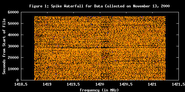
Also notice that the signal strength (or "power") of
each spike is color-coded:
- Black: No spike
- Brown: Spike power is between 0
and 10
- Red: Spike power is between 10
and 100
- Orange: Spike power is between
100 and 1000
- Yellow: Spike power is between
1000 and 10,000
- Green: Spike power is between
10,000 and 100,000
- Blue: Spike power is greater
than 100,000
Thus, the strongest signal spikes found in the data are blue,
while the weakest spikes are brown. The strongest spikes are
almost certainly terrestrial in origin, since they require large
amounts of energy to create, and the strength of any signals
arriving from deep space will have dissipated considerably by the
time they reach Earth.
Reducing Waterfall Density: Viewing Spikes at a Specific
FFT Length
There are so many signals displayed in Figure 1 that it's
too crowded to able to see any patterns in the data.
However, if we select a subset of the data, such as only
those spikes detected from an FFT
length of 16k, the plot becomes less crowded and
patterns begin to emerge.
Figure 2 shows only those spikes detected from an FFT
length of 16k (a total of 17,464 spikes). Note the vertical
lines at 1419 and 1421 MHz. The signals detected at these
two frequencies are not from extraterrestrials; rather, they
are "test signals" (also called
"birdies") we inject into the telescope receiver
to make sure that the instrumentation and software are
working properly. Also notice that at an FFT length of 16K,
we're mostly detecting signals with strengths less than 100.
The Power Distribution of Spikes
Let's take a closer look at the signal strengths of the
spikes. Figure 3 is a histogram showing the number of spikes
detected at each power. Notice that the vertical (y) axis
has a logarithmic scale, where each major incremental mark
represents a quantity 10 times the major mark beneath it.
Logarithmic scales are useful for displaying data with very
long ranges, such as the case here where the number of
spikes at a given power ranges anywhere from 0 to 100,000.
Also notice that the upper-bound of the horizontal (x) axis
is 1000. We saw from the blue dots appearing in Figure 1
that spike powers can have magnitudes well over 100,000. In
fact, there is no upper limit to the power any given spike
can have; there are spikes in this sample with powers
extending beyond 13 decimal spaces. This power range is way
too large for even a logarithmic scale to handle—all of
the low-power spikes would be bunched up on the left, making
it difficult to discern any patterns. Since the vast
majority of spikes have powers less than 200, we restrict
the plot to powers less than 1,000 so that we can view the
distribution of these spikes more clearly.
As you can see, Figure 3 has a very
interesting pattern. The peaks on the left of the graph, the
largest of which are located at power values 44, 88, and
176, come from spikes detected by analyses using FFT lengths
of 32k, 64k, and 128k, respectively. As the FFT length
increases, the power threshold for signal detection is set
higher; this increased threshold compensates for the fact
that power values are amplified for analyses at long FFTs.
So, analyses performed at an FFT length of 128k won't detect
signals weaker than 176, etc. Also, analyses using longer
FFTs are better at detecting narrowband spikes, and so you
see high peaks in the graph where each analysis at a
particular FFT length "kicks in". The hump on the
right of the graph, peaking at a power of about 700, is from
the strong test signals we inject (the same test signals
visible in Figure 2). These test signals produced a hump in
Figure 3 rather than a sharp peak because they can vary in
terms of their relative power. (Their average is 700, but at
any given time an individual test signal can be weaker or
stronger than 700.) If we remove these "birdies"
from the data, the hump disappears, as shown in Figure 4.

Power Distribution at FFT Length 128k
Let's examine a subset of the power distribution, taking
only spikes detected from analyses using an FFT length of
128k, with test signals removed. Figure 5 shows the
distribution of these signal strengths. As mentioned
earlier, a SETI@home analysis using an FFT length of 128k
should only report spikes whose power is greater than 176.
Note the small hump on the left of the graph, centering at a
power of around 95. We have no explanation for these spikes
yet.
What Kind of Distribution Would One
Expect From Noise?
In Figure 5 above, most of the spikes are detected just
above the threshold of 176—fewer and fewer signals are
detected at higher powers. It turns out that this
exponential drop-off follows the same pattern as a Chi
Square distribution with two degrees of freedom.
Interestingly, the power distribution one would expect for
pure noise also follows this same pattern. Hence, the vast
majority of signals that follow this pattern can be
attributed to noise. Most of the remaining signals that
don't follow the noise pattern (such as the excess of
signals with power ranging from 225 to 500) are mostly (if
not all) due to radio frequency interference. Luckily, the
number of these RFI signals is very low (about 1% of signals
detected).
Of course, extraterrestrial signals might be imbedded in
the noise pattern somewhere or in the range we attribute to
RFI. Further analyses are being performed to determine which
spikes (if any) occur consistently from specific locations
in the sky. A spike that occurs repeatedly from the
direction of a particular star, for example, would be a
candidate for extraterrestrial origin. In this way we hope
to discriminate signals caused by extraterrestrial
civilizations from signals caused by noise, events on Earth,
satellites, or natural astronomical events.
Conclusion
Of the 478,716 spikes we addressed in this newsletter, about
3% are actually test signals ("birdies") that we
inject into the data, and about 96% follow a pattern
attributable to noise. We currently attribute the final 1%
of signals to RFI and technical anomalies (the small hump in
Figure 5 may turn out to be one such anomaly). More
sophisticated analyses are underway to determine which of
these signals are arriving consistently from specific
locations in the sky—characteristics that might indicate
extraterrestrial communication. |
Back to Top
Home
|
|
|