
This is the start of my Juelle Web Design Course.
Lesson 1 - Color Co-ordination.
********************************
The object of this lesson is to learn to co-ordinate your colors to make you website stand out from the rest, so to speak.
It is very important that your visitors enjoy your website as they visit & the colors of the website make this more so important to make you website look perfect, or as perfect as it can be.
I picked 4 contrasting colors from Deep Red to Pink as I thought these colors went pretty well together.
The object of this Lesson was to put these colors together on this Webpage & to show the 4 colors that I used for this page & website.

These colors are " standard " in the Paint Shop Pro colors palette.
Color values below, from left to right are:-
Swatch 1 - #800000
Swatch 2 - #c00000
Swatch 3 - #ff4040
Swatch 4 - #ffc0c0
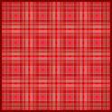
To get the effect for my background tile I used the image below using my 4 contrasting colors.
( reduced to 60% for easy loading ).

I applied the effect " Where are you ? " from the Toadies plugins collection.
I then applied the " Diamonds " effect ( 4 times ) from the Simple Filters plugins collection.
I then re-applied the effect " Where are you ? " & finally sharpened the image.
This is the finished Tile.
( reduced to 60% for easy loading ).
Here endeth the 1st Lesson LOL
Thanks for looking.


Website created using 1280 X 1024 resolution.


Copyrights & Web Design by ©HVDesign2005 - All Rights Reserved
|